Canopy
I directed a complete redesign of our flagship product line
(Client)
Canopy Tax
(Year)
2019
(Disciplines)
SaaS design, mobile design, Information architecture, accessiblity

modernize
everything
Complete product facelift
// Background
Canopy underwent a dramatic business pivot moving away from the sole practitioner to larger market clients. This left our practice management product behind in features, brand, and overall user experience.
// Problem
New customers weren’t super excited about our product during demos, but when they did commit, the product didn’t deliver the value expected and users were disappointed and confused. Also, our brand team dramatically changed the companies look and feel. Our product needed to be aligned with this new direction.
// Process
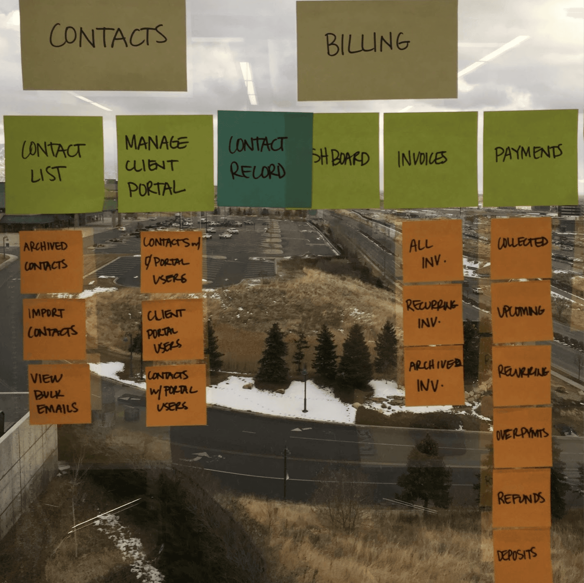
Audit of Product & Customers
Team app walkthrough to map current customer UX
Problem discovery and synthesis
Project Goal Definition
Prioritize projects and scope of the work
Stakeholder research, alignment of goals
Value Prop Ideation
War room team brainstorms
Wireframes, Mockups, Prototypes
Prototyping & Testing
Interaction and UI ideas
Figma mocks and Maze user testing
Iterative, ensure defined goals were being met
Development Support
Build new components hand-in-hand with dev
Release new designs, iterate on customer feedback
// Solution
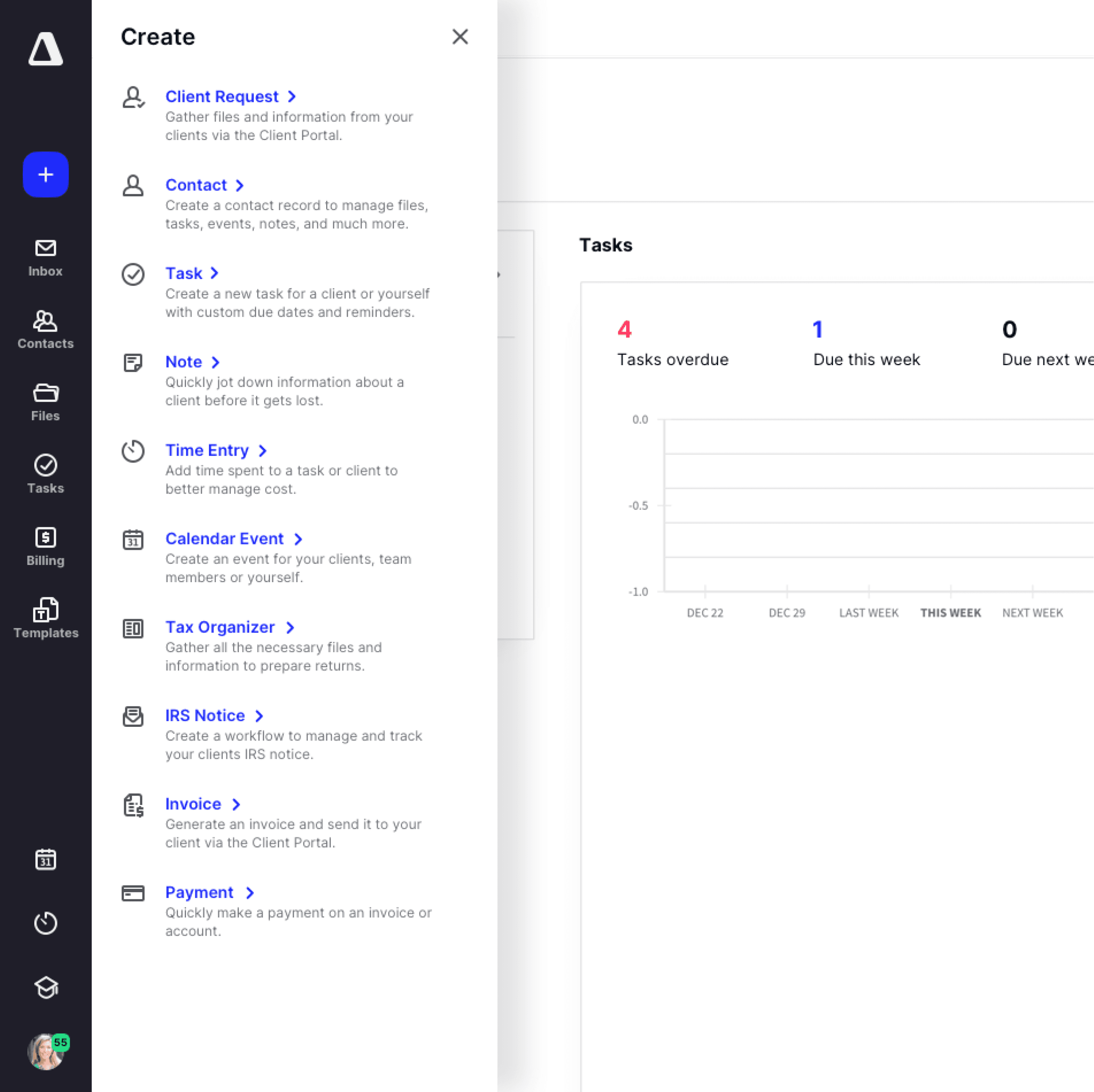
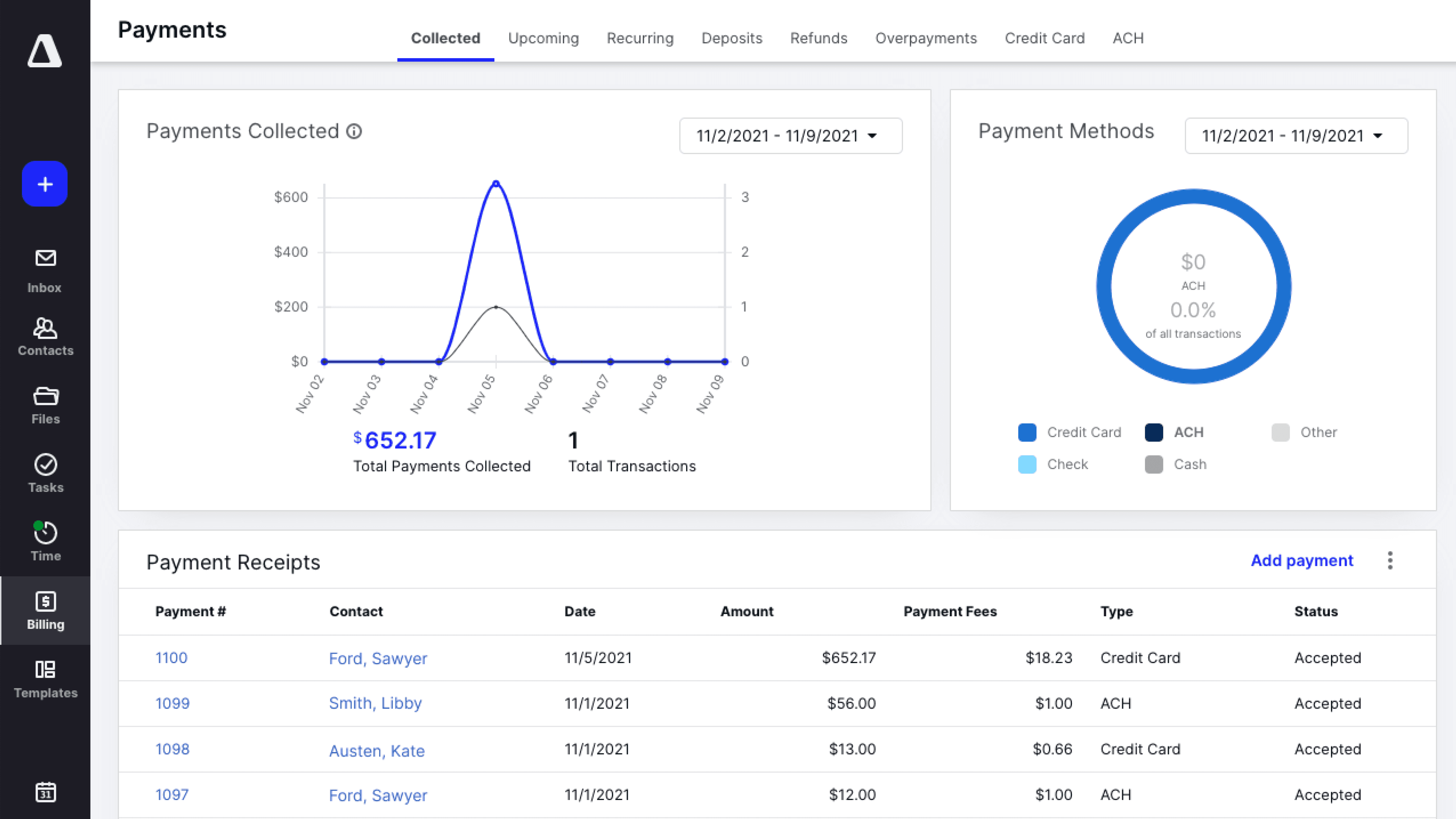
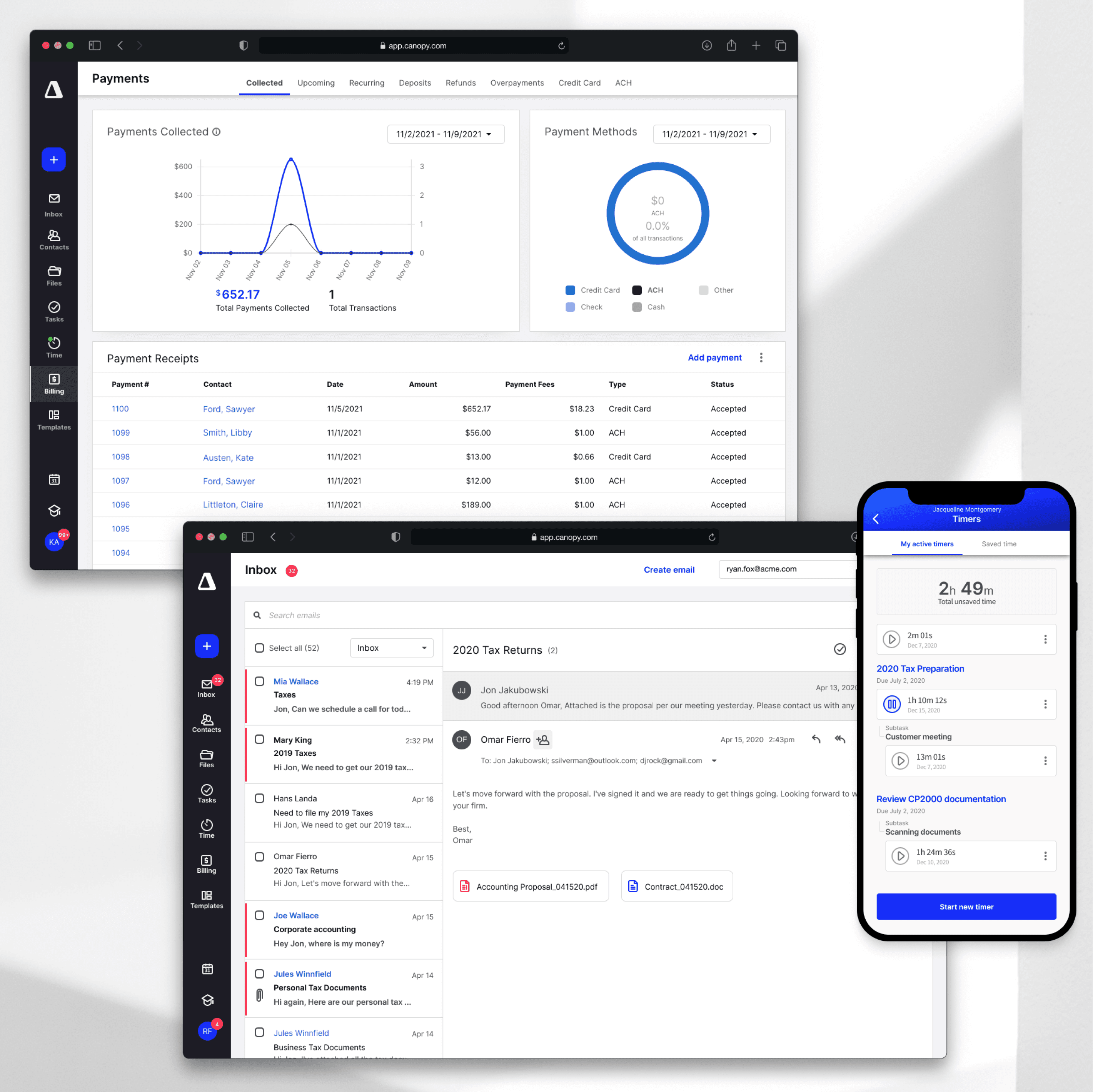
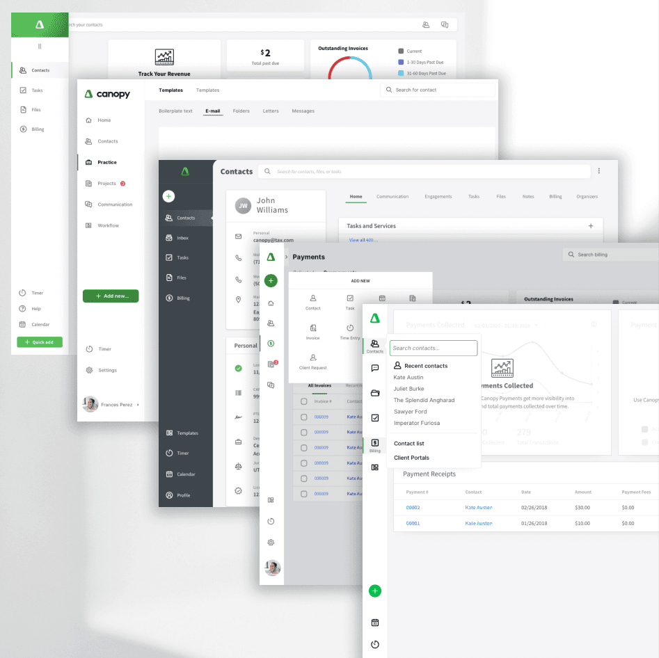
We updated the entire look, feel, and interaction of the product to match new brand, improve overall readability, meet AAA accessibility goals, and ensure users can find the features and content efficiently.
Created a new navigation bar to improve overall IA
Matched workflows to new customer mental models
Implemented new brand and color schemes
Improved overall color contrast to meet universal design goals
Update typeface and styles for better readability
Want to learn more? Let's Talk


Canopy
I directed a complete redesign of our flagship product line
(Client)
Canopy Tax
(Year)
2019
(Disciplines)
SaaS design, mobile design, Information architecture, accessiblity

modernize
everything
Complete product facelift
// Background
Canopy underwent a dramatic business pivot moving away from the sole practitioner to larger market clients. This left our practice management product behind in features, brand, and overall user experience.
// Problem
New customers weren’t super excited about our product during demos, but when they did commit, the product didn’t deliver the value expected and users were disappointed and confused. Also, our brand team dramatically changed the companies look and feel. Our product needed to be aligned with this new direction.
// Process
Audit of Product & Customers
Team app walkthrough to map current customer UX
Problem discovery and synthesis
Project Goal Definition
Prioritize projects and scope of the work
Stakeholder research, alignment of goals
Value Prop Ideation
War room team brainstorms
Wireframes, Mockups, Prototypes
Prototyping & Testing
Interaction and UI ideas
Figma mocks and Maze user testing
Iterative, ensure defined goals were being met
Development Support
Build new components hand-in-hand with dev
Release new designs, iterate on customer feedback
// Solution
We updated the entire look, feel, and interaction of the product to match new brand, improve overall readability, meet AAA accessibility goals, and ensure users can find the features and content efficiently.
Created a new navigation bar to improve overall IA
Matched workflows to new customer mental models
Implemented new brand and color schemes
Improved overall color contrast to meet universal design goals
Update typeface and styles for better readability
Want to learn more? Let's Talk


Canopy
I directed a complete redesign of our flagship product line
(Client)
Canopy Tax
(Year)
2019
(Disciplines)
SaaS design, mobile design, Information architecture, accessiblity

modernize
everything
Complete product facelift
// Background
Canopy underwent a dramatic business pivot moving away from the sole practitioner to larger market clients. This left our practice management product behind in features, brand, and overall user experience.
// Problem
New customers weren’t super excited about our product during demos, but when they did commit, the product didn’t deliver the value expected and users were disappointed and confused. Also, our brand team dramatically changed the companies look and feel. Our product needed to be aligned with this new direction.
// Process
Audit of Product & Customers
Team app walkthrough to map current customer UX
Problem discovery and synthesis
Project Goal Definition
Prioritize projects and scope of the work
Stakeholder research, alignment of goals
Value Prop Ideation
War room team brainstorms
Wireframes, Mockups, Prototypes
Prototyping & Testing
Interaction and UI ideas
Figma mocks and Maze user testing
Iterative, ensure defined goals were being met
Development Support
Build new components hand-in-hand with dev
Release new designs, iterate on customer feedback
// Solution
We updated the entire look, feel, and interaction of the product to match new brand, improve overall readability, meet AAA accessibility goals, and ensure users can find the features and content efficiently.
Created a new navigation bar to improve overall IA
Matched workflows to new customer mental models
Implemented new brand and color schemes
Improved overall color contrast to meet universal design goals
Update typeface and styles for better readability
Want to learn more? Let's Talk
